
Work, so far
First, we rebranded ourselves.
Before we touch your brand, here’s ours. We tested the crazy on ourselves first.
Here’s the idea. Here’s why it’s crooked on purpose.

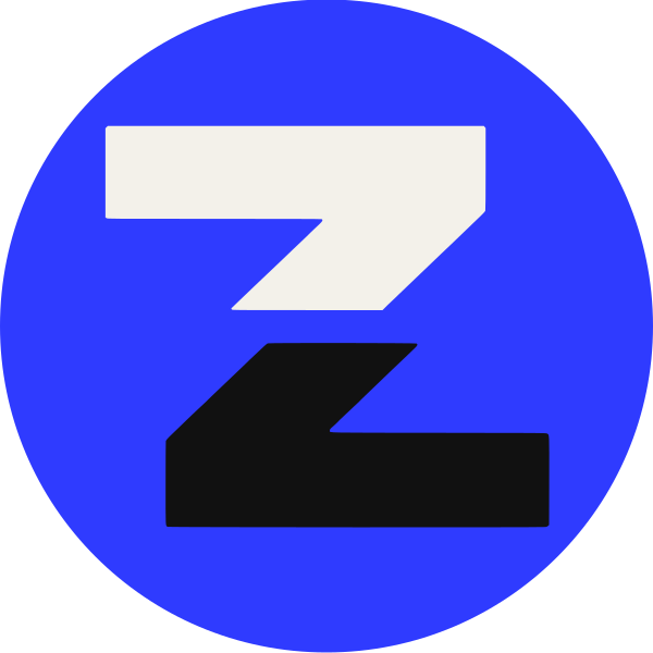
The idea, in one cut
One word, cut in two. The top half stays still. The bottom half breaks out to the right and takes on the color. Creative and crazy, sharing one word and not quite agreeing.
Why it works on you
It explains the name without explaining it. You read a word, then you look twice. That second look is the brand.
The only rules we keep
Same cut every time. Right and down only. Color lives below. The halves never line back up, because a closed word is just a word.
Ink, mostly
Paper, plenty
Electric, once
Aa
Unbounded. For headlines that can’t sit still.Aa
DM Sans. Everything you read twice.Coming soon. We’re picky.
Case 002 could be yours. Case 003 is already jealous.
New case studies are on the way. Want to be the one we brag about?